Using the list/grid switcher
The switcher lives on Archive Loop. Builder group names differ slightly; the visitor control and cookie are the same. See Archive Loop (Divi 5) or Archive Loop (Divi 4) for every related field.
Purpose
The list/grid switcher adds a control so visitors choose how filtered results display—dense Grid cards or a vertical List—without reloading the page.
Enable the switcher
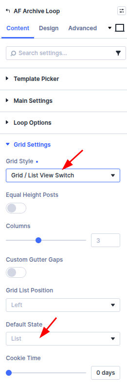
Divi 5
Located in: Archive Loop → Content → Grid Settings
- Edit Archive Loop on the page.
- Set Grid Style to Grid / List View Switch.
- Set Grid List Position (left or right of the loop header).
- Choose Default State (grid or list) for the first visit.
- Set Cookie Time (days) to remember the visitor’s choice; use 0 for session-only memory.
Divi 4
Located in: Archive Loop → Content → Grid Options and Grid/List View Options
- Edit Archive Loop on the page.
- Under Grid Options, set Grid Style to Grid / List View Switch.
- Open Grid/List View Options.
- Set Position (left or right).
- Choose Default State (grid or list) for the first visit.
- Set Cookie Time (days); use 0 for session-only memory.
Style the toggle buttons in the Design tab under Grid/List View Button.
After Ajax filtering, the active view persists for the new result set.
Custom loop layouts
Built-in loop templates include list/grid styling out of the box. When you use a Divi Library layout, you design one card that must work in both views. The plugin toggles layout with CSS classes on the Archive Loop wrapper—it does not reload different layouts per view.
Typical workflow:
- Set Loop Style to Loop Layout (Divi 5) or Custom Layout (Divi 4) and pick your library layout.
- Set Grid Style to Grid / List View Switch.
- Build the library layout with loop item modules such as Post Thumbnail and Post Title (Divi 5). See Custom loop item modules. On Divi 4, use the Thumbnail and Post Title modules inside the same library layout.
- Add helper classes on modules (see below) and write CSS in Divi → Theme Options → Custom CSS or your child theme.
If grid view looks wrong with a custom layout, you usually need CSS for both views—column widths, image size, and spacing are not applied automatically the way they are for built-in templates.
How the switcher works
When Grid / List View Switch is enabled, the Archive Loop module gets wrapper classes such as:
| Class | When it applies |
|---|---|
grid-layout-grid_list | Switcher mode is on |
de-grid-view | Grid view is active (default or visitor choice) |
de-list-view | List view is active |
de-position-left-view / de-position-right-view | Switcher button alignment |
Each loop item is wrapped in grid-col (or li.product for WooCommerce) and grid-item-cont. The outer results container uses divi-filter-archive-loop and custom-loop-layout for library layouts.
The switcher buttons live in .divi-engine-grid-list-view-switcher. Clicking grid or list swaps de-grid-view / de-list-view on the Archive Loop and stores the choice in the divi_engine_grid_list_view cookie.
Helper classes for your layout
Add these in each module’s Advanced → CSS ID & Classes → CSS Class field (not in Theme Options).
| Class | Purpose |
|---|---|
de-hide-list-view | Hide this element in list view |
de-hide-grid-view | Hide this element in grid view |
de-no-stack | Keep columns side-by-side in grid view (add on the Row that should not stack) |
Example: hide a “Read more” button in list view—add de-hide-list-view to that button module.
Built-in templates use these classes internally. For custom layouts, you combine them with your own CSS.
Custom CSS for grid and list views
Write view-specific rules in Theme Options → Custom CSS (or your child theme). Scope selectors with the wrapper classes the plugin adds to Archive Loop.
Hide elements (handled by the plugin if you used the helper classes above):
.de-list-view .de-hide-list-view,
.de-grid-view .de-hide-grid-view {
  display: none !important;
}
These rules are already loaded by the plugin; you only need them if you override display elsewhere.
Style an element differently per view (add your own class, e.g. my-loop-image, on the module):
/* Grid: full-width card stack */
.grid-layout-grid_list.de-grid-view .my-loop-image {
  width: 100%;
}

/* List: thumbnail left, content right */
.grid-layout-grid_list.de-list-view .my-loop-image {
  width: 33%;
  float: left;
  margin-right: 3%;
}

.grid-layout-grid_list.de-list-view .my-loop-content {
  width: 64%;
  float: left;
}
Side-by-side columns in grid view — on a Row inside the loop item, add de-no-stack so columns stay horizontal in grid view. In list view, the plugin forces a single column (grid-template-columns: repeat(1, …)).
Full-width columns inside each grid cell — in grid view, nested Divi columns inside .grid-item-cont are forced to 100% width so each card stacks vertically. Use de-no-stack on the Row when you need a multi-column card in grid view.
Built-in loop templates
If you use a built-in loop style instead of a library layout—Loop Style → Loop Templates in Divi 5 (for example Divi Blog Style), or Default / product loop styles in Divi 4—list/grid CSS is already included. You only need the helper classes and custom CSS when building your own library layout.
Related settings
- Grid, list, masonry, and pagination — Pagination, masonry, and equal height
- Loop templates and layouts — Built-in vs library loops